Showing posts with label design. Show all posts

Monday, November 23, 2009

It's the International Year of Astronomy!

If you were in the dark on this, no worries. I overlooked it too, but we still have a little over a month to celebrate. Here is some recommended party decoration:


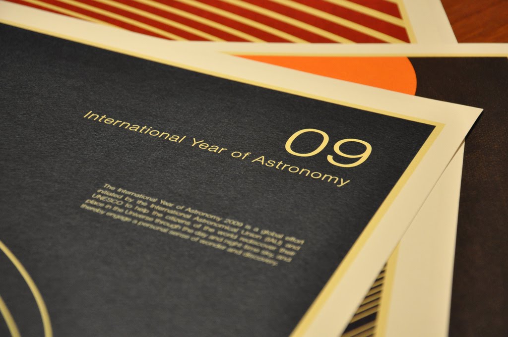
Official IYA09 poster series


New York Times Magazine featured posters being used for the IYA09 designed by Simon Page. I love them for their retro-textbook feel, simple geometric patterns.

"The result is a beautiful exercise in conceptual minimalism, with a clear geometric bent that betrays Page’s math-nerd origins." Alexandria Symonds, NYTimes Mag

The part that really pisses me off about this Simon Page fellow is that he wasn't even trained in design. His background is in applied mathematics. He just sort of picked up design as a hobby two or three years ago. If I were to guess, he's also a champion fencer, a published novelist, and prefers to spend his free time volunteering at a hospital for children.

But perfection can be bought and is now available for purchase in his store.


love the use of white space in this one


* * *


I took cosmology in college -- the lovechild of astronomy and philosophy. By the end of the semester, I took away a few things:
1) Theoretically, we could be sucked into a black hole and routed to a parallel universe at a different point in the space-time continuum;
2) I thought that would be really cool as long as I was transported to the time of Jane Austen and was part of the landed gentry (requirement), but I don't think it works like that without a DeLorian DMC-12 outfitted with a nuclear reactor;
3) My mental capacity was much smaller than previously thought; and
4) Stephan Hawking has fathered children.

Tuesday, November 3, 2009

This Is Cooler Than My Obama Action Figure


A former coworker at The Royal Order, Scott Thomas, went on to fame as the Design Director for the Obama campaign. He's coming out with Designing Obama, a book dedicated to artwork surrounding the campaign. There are forwards by Steven Heller and Michael Beirut (design celebrities!).

The book shows the role of art and design in the official campaign and also includes unofficial pieces done by grassroots supporters. Hopefully Obama Hot Sauce (it exists) is included. And Obama-Fingers certainly are because it brilliantly melds racial stereotypes with images of the Golden Gate Bridge and the American flag.

Danke, Germany

But something tells me that the 'unofficial grassroots art' is going to be classier stuff than the Hanes tshirts with the iron-on transfer of an Obama family photo that were being sold 2-for-1 around Grant Park. There really has been some good-looking work created surrounding the campaign. I have no doubt that the book will be beautifully crafted, so I'm looking forward to seeing the finished product.

It's being self-published through Kickstarter (keeping with the grassroots theme). If you're interested, it's available here with a minimum pledge of $50, but the price goes up November 5. It's estimated delivery is around the first of the year.

Monday, November 2, 2009

Golden Birthday Spoils

My birthday on Wednesday. This was a big birthday -- the golden birthday -- 28 years on the 28th. I've waited a long time for this one and it didn't disappoint.

If there's one thing that I've learned from my experience of having birthdays over the years, it's that you need to set expectations high and be vocal about them. For example: I've never been happy simply with a single birthday, so I usually enforce a birthmonth celebration. This sandwiches the actual day with 15 more days on either side to exercise tyranny and partake of gluttonous pursuits.

This year, for the golden birthday, I was very clear that I expected all gifts to come in the form of gold. The real nutty part is that Rob actually takes them seriously and I received some pretty amazing earrings.


But the list of loot doesn't stop there...

I still receive birthday money from my grandmothers and I'm not above accepting it and spending it immediately. I'm on the search for some black boots (a search that deserves its own post), but then I got distracted by Amazon -- the black hole of shopping -- and never returned. I did score a ton of amazing books though to add to the library that we have no room to accommodate. The wine they're serving in the breakroom this afternoon may have something to do with it.


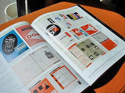
Graphic Design, Referenced
from UnderConsideration


The UnderConsideration online network includes, Brand New and FPO: For Print Only, both of which I read regularly. So I figured it was low-risk to invest in one of their books without paging through beforehand. This reference is 400-pages (so you know you're getting your monies-worth per page) cataloging basic principles, sought-after resources, influential designers, iconic work...

This book was recently profiled on grain edit. And it is now mine. All mine.


Images from grain edit


The Sartorialist
by
Scott Schuman

I use The Sartorialist blog as a motivational tool. It gets me out of the jeans, long-sleeve tee, and Converse sneaker rut that I'm prone to fall into. His eye for beauty is so enviable -- he finds it everywhere and unexpectedly. He reminds me to pay attention.


Paperback version cover

There's a hardcover deluxe version, but it's quite expensive. As much as I appreciate the craft of beautiful book design, I was really buying it for the photographs.

His girlfriend, Garance Dore, who keeps a blog that I value for similar reasons, hinted at coming out with a book of her own at some point in this interview my friend Amie did with her for shopbop (Super-cool name drop! Oui!). I'll support.


Penguin Classics
designed by
Coralie Bickford-Smith

When my brother, Mike, was in town this past weekend, we hit up the bookshops. Both of us could spend an entire afternoon paging through books, revising our to-read lists and commenting on book design. We disagree a lot, but we certainly agreed that the new clothbound Penguin Classics were super sweet. I snatched up Wuthering Heights that day.


The first set of ten already released


I bought a few more of the first set on Amazon. They're selling for amazingly cheap price of $13.60, so I couldn't resist when I added the extra inducement of wine in the afternoon.

The second set -- I don't know when this is coming out


And thus ends the tale of a very spoiled and happy birthday.

Thursday, October 22, 2009

Invitations continued

I say I'm going to post something the next day, and then it takes me over a month to actually do it... Here are some shots of our invites. The quality of these images are not so good. In hindsight, I should have had our photographer get some shots, while we had her in our power.


Folded up, referencing our Save the Dates


In the process of unfolding (I'm trying to give the full experience)


Lots of info for those not inclined to use the internet


Not the most accurate map, but people should really just use the internet.
Grandparents, let that be a lesson to you.


Flip side: the Alphabet poster that took a large chunk of my life to illustrate
The letters G, S, and T are supposed to coordinate with the itinerary on the other side.
Don't know if that was clear.


I do like to design me some icons


Personal stories surrounding the alphabet.


Wedding invite and tourist brochure


RSVP cards -- Rob lobbied to use the phrase "meal of food"

Weeks later, Rob pointed out a typo. My instinct was to get really angry at him, then cry. It was a small misspelling, but it's enough to annoy me for all of eternity.

My intention is to turn this into a more generic poster for Door County and to seek my fortune in the gift shop circuit (that will hopefully cover cost of production). This time, there will be no misspellings.

Thursday, August 6, 2009

Wedding Invites and Throwing Stars

I had kind of cut myself off from reading any wedding blogs a few weeks ago to keep things sane. But I cheated and peaked at Green Wedding Shoes this morning, where I found examples of some awesome new invites from Studio on Fire and someone I previously had not seen, Erin Jang.

Ms. Jang does some handsome and clever work. And her type takes my breath away (and type really can do that -- take breath away).


I like the carnival-esqueness to this, like your organist should be the bearded lady and the ring bearer the two-headed boy, bride and groom depart on elephant...


I would keep this program if I went to their wedding

This type is gasp-worthy


When I kicked off design of my own invites, I did a lot of hunting for inspiration and image loading. I was finding a lot of the same stuff out there -- birds, big blooms, everything letterpressed -- lots of pretty stuff, but not especially thoughtful, so most just blended together. Once in a while something would really blow me away, and it was more often than not from Studio on Fire.

Here are some more recent pieces:


This pattern is somewhat unexpected for a wedding invite


It's all bird-trendy, but this type is so handsome


Not a wedding invite, just cool


I need to get my act together and photograph our finished invites. I'm really happy with how they turned out. Here's a preview of the folded and packaged piece, pre-envelope stuffing:


Friday, July 31, 2009

Weekend Sovereignty

Rob is gone on his bachelor weekend to Northern Michigan, which means the apartment is my dominion and I have unconditional Krista-time.

The royal to-do list for the weekend:
1. Go for a bike ride/picnic with Gabby
What's exercise without the promise of food? I'm in charge of the picnic eats, so I'm thinking of making these two things that Martha says I should and this recipe I've been dying to try from Sprouted Kitchen.


Chicken Salad and Havarti Cheese Wrap (Martha)


Chickpea, Cherry Tomato, and Feta Salad (Martha)


Carrot Cake-wiches with Greek Yogurt (Sprouted Kitchen -- her photography is amazing)


2. End my summer sewing hiatus. Bridesmaid gift spoiler alert.
I'm making clutches as part of their gifts for being attendants. I just found some awesome fabric from JoAnn's (quelle surprise?!). Here's hoping they turn out...

3. Watch all of Mad Men Season II while drinking scotch
Rob likes to watch TV series in moderation, whereas I prefer to wait for the DVDs and watch the series all in one sitting. There's something wonderful about getting caught up in the story, not noticing that the sun went down, and later realizing that it's already 3am and, dammmit, you don't care.

Product placement works. Mad Men puts me in the mood to drink scotch and I plan to do just that. We only have Dewar's at the moment, but that will nobly fill the bill.

4. Get coffee from Julius Meinl and hit up the bookstore
I love Julius Meinl for the following reasons in descending order of importance: a) the founder is Bohemian, b) they have great packaging, and c) I like the taste of their coffee.


5. Sleep diagonally

Friday, April 17, 2009

A Better Weekly Weird: American Society for Social Hygiene

I wasn't totally sold on the 'weirdness' of yesterday's Weekly Weird, so I thought I would redo it by posting this public service announcement I found via Studio on Fire. They used it to advertise their birth announcements :)


Beware the autorides.


Speaking of Studio on Fire, if you want to see some truly inspiring and beautiful letterpress design from a nice, respectable Midwestern design shop, check out their blog, Beast Pieces. Here's a sampling of their cool work:


Love how the solid color block brings out the texture on the Crane's Lettra


Pretty wedding invitations -- I like non-traditional wording and format

Friday, April 10, 2009

Fuck you, Gocco

So I had a gocco disaster when I tried to print our save the dates a while back. It really wasn't Mr. Gocco's fault as I soon learned the intended design was totally inappropriate for the medium, but I was still angry with him.

To add to the mess, I also lost a goodly number of freshly addressed, lined, and stamped envelopes out of my car window when I was in an accident last month. I thought these were fated to never go out.

But my luck changed. I'm fortunate to have a generous matron of honor and mother that helped redo things in a matter of a couple hours. I had other offers of support (thanks, Betsy!) which warmed my heart. And it turns out that the combination letterpress-offset cards look beautiful.

My moo-cow creamer, who also survived the crash, makes his debut on this blog


printed with all soy-based inks


paper is Mohawk Superfine Eggshell-finish White (manufactured with windpower)


liner paper is French Mod-Tone Violet (wish I had a better picture)
envelopes are Paper Source Khaki, sized A6


And as for Gocco, we will hopefully be more successful printing our thank you notes, so he can redeem himself in my eyes.

Thursday, March 26, 2009

Color-coordinated shelves -- to do or not to do?

When Rob moved into his previous apartment, I helped organize his movie collection. Having a bunch of plastic DVD cases up on a bookshelf usually looks so horrible, so I thought I would at least simplify the clutter by organizing them by color on the shelf.

This method of organization makes sense to me. Being more of a spatial versus verbal learner, I remember where things are by sight and color much quicker than scanning words and I usually remember the general appearance of a book or movie cover that I own.

Example: when I'm looking for Harry and the Hendersons, I immediately know to look in the blue section. On a side note, if you haven't seen anything weird today, check out the German intro to Harry and the Hendersons, the TV show.


Harry was more of a Kinesthetic Learner


I was out-numbered: Rob and his roommate, Aaron, had them in alpha order by the month's end. But I still think there's something to the color-method. Anyone else?

Hey, at least it looks neat: